Blog topic suggested by Zac Crofford. This isn’t entirely a rant. An anti-rant? This is a happy rant.
I frickin’ love fonts, and I love when I open a book and the typeface is pleasing to my eyes. Unlike many of my colleagues, I am not pained by the existence of over-used fonts. Rather, I am pleased because hey, look, something I recognize! I dabble in Comic Sans and Papyrus now and then, but not too often. They’re like… peppercorns. Tasty, but overpowering. You have to know what to pair them with.
On the other hand, there are many fonts I adore, that I fondle with my eyes. If I ran the publishing industry, every book would be in a different font, and they’d all be pretty yet readable.
Hrm… if I ran the publishing industry, a lot of people would be mad at me. 😀
Examples I love:
Titillium – yes, I actually liked the special font my university bought for itself and recently discontinued. I like how it has this sciency-yet-understated feel. I have a weird fondness especially for the V and the W.
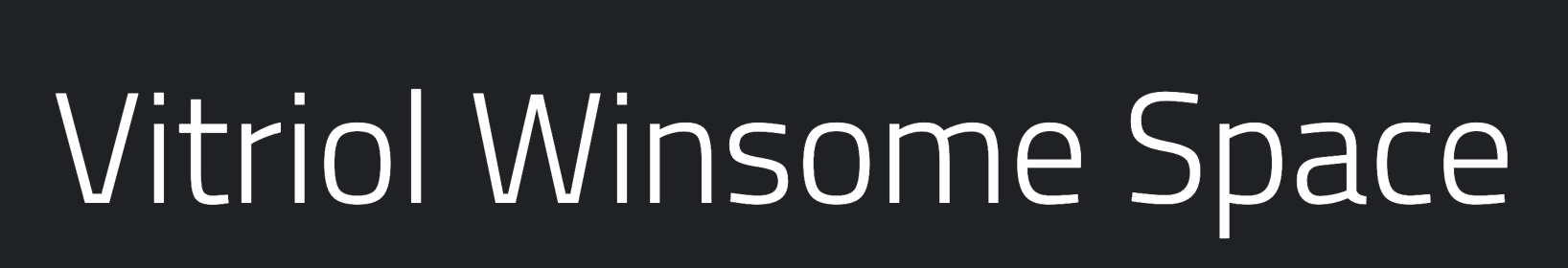
Interstate – mostly nostalgia, but isn’t that lower-case g the cutest?? I was so heartbroken when the highways updated their font. The sign to get off on Carnegie from 90 Eastbound was late to be replaced, due to construction on the innerbelt, and I lavished affection on it every time I passed.

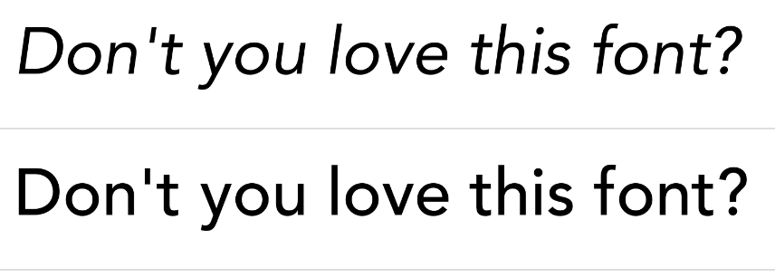
Avenir – so clean, so light. I particularly like its italic version. A good book-text font. Hrm… I do seem to have a sans-serif fondness.
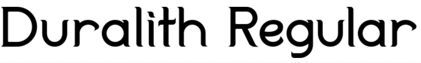
Oh – here’s a cute one with serifs! I really love the curviness – like a roller coaster for the eyes!
POSITRONIC TOASTER
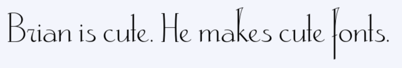
I wasn’t going to make this post and not talk about my husband’s font. I had input on this font! He was always asking me “What do you think of THIS D, or THAT D?” or “Is the kerning good between the R and the G?” “Is the top of the K high enough?” I feel invested. But it really is a fantastic “special use” font for title art or invitations, and Brian made sure it has all the diacriticals for Vietnamese SO MANY DIACRITICALS – and you can buy it at myfonts.com!
And look, SERIFS! ha! I do like Serifs. Hell, I use them in my calligraphy EVERY TIME. But I guess I like to save them for the title page.
I guess you could say I look for variety in my fonts. I get excited when a book is in something new, even if it’s just like Garamond but with rounder a’s or something. Watching Brian craft fonts really made me appreciate all the difficult work that goes into lovingly hand-crafting a font, the ligatures, the special cases for kerning – like when a fat round C is next to a skinny L. Preparing for accent marks, checking how dense the lettering is at different distances… it really is a beautiful art form, one I’m glad other people do for me!